Context & challenge
My role
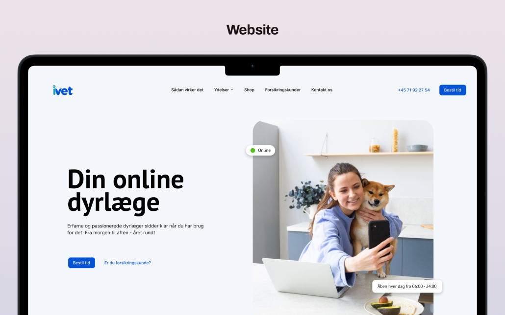
Impero is a cloud-based GRC platform used by 200+ enterprise organizations across Europe, including some of the largest companies in the DAX40. It helps finance, tax, and compliance teams manage risk and internal controls at scale. I joined as Head of Design and spent seven years shaping the product experience from the ground up.

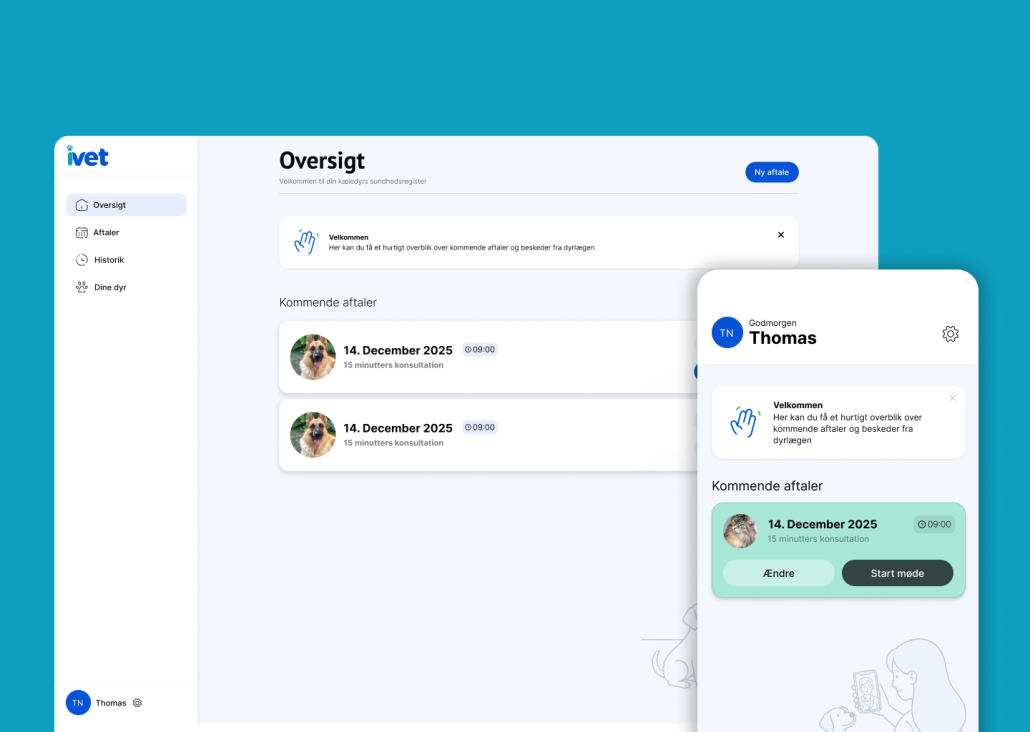
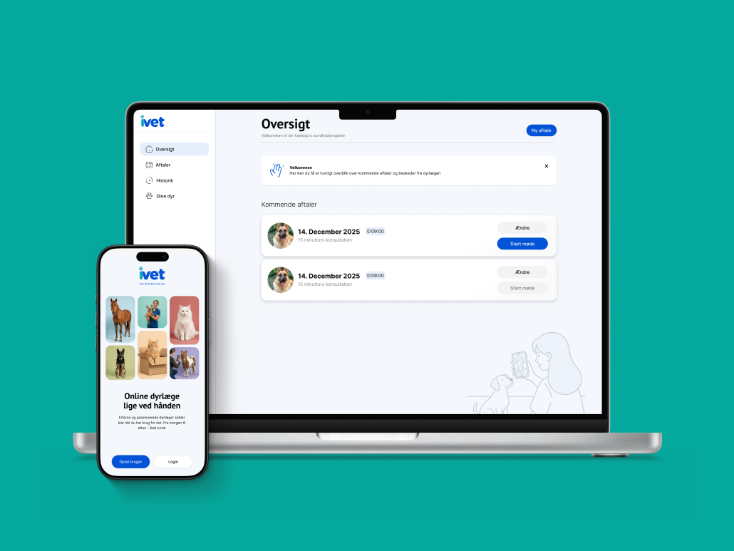
UX & UI design, CMS, Brand