A cohesive product experience

Role & scope

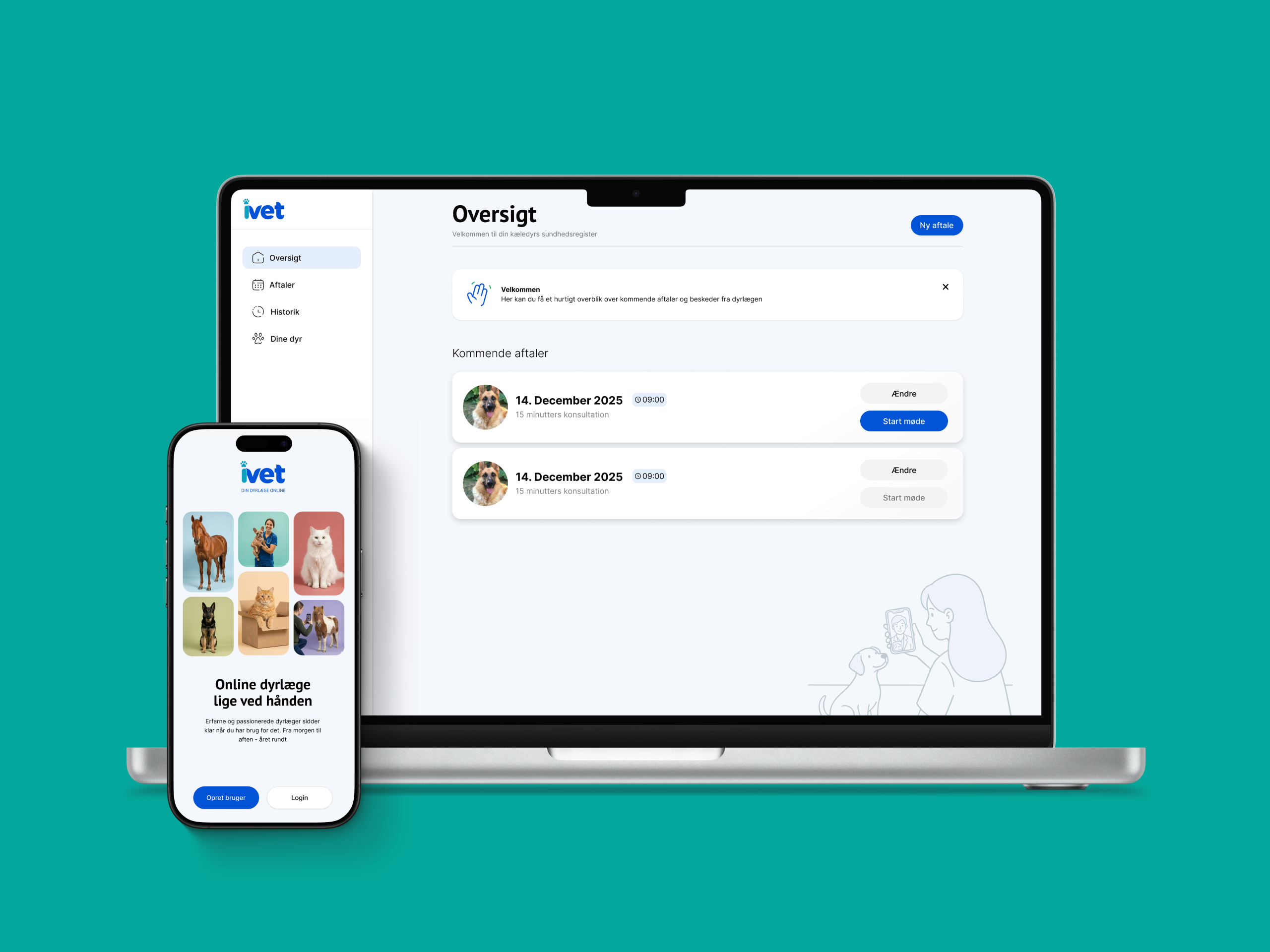
iVet is a Danish telemedicine platform connecting pet owners with qualified vets through online video consultations, available daily from 06:00 to 24:00. Founded by vet Christina Aggerholm in 2022, iVet gained national attention after appearing on DR’s Løvens Hule in January 2024, attracting bids from three investors and landing a deal with Anne Stampe. The platform serves both direct customers and insurance customers through partnerships with several of Denmark’s largest insurers. I was brought in to bring design coherence to a product that had been touched by multiple designers and had grown inconsistent as a result.

UX & UI design, CMS, Brand