Overhaul for Denmark’s leading car marketplace

Bilhandel.dk is one of Denmark's most visited online marketplaces, with over 500,000 monthly visitors buying and selling cars. At that scale, friction in the core user journeys doesn't just frustrate users — it directly affects dealer leads and platform revenue. I was brought in as a freelance consultant to identify the usability gaps and redesign the experience from search through to listing.
Context

The platform had grown over time and it showed. Inconsistent visual patterns, a cluttered landing page, and unclear flows around search, filtering and listing creation were creating friction at exactly the points where users needed to make decisions. For a marketplace that lives and dies on connecting buyers with the right car quickly, that friction had a direct commercial cost.

Design challenge
  • Search and filtering flows that created cognitive load and drop-off
  • A landing page that overwhelmed infrequent users rather than guiding them
  • Inconsistent UI patterns across viewports
  • A listing creation flow with too many errors and incomplete submissions
  • No shared component system to ensure consistency going forward
Outcome
  • Clearer navigation and search flows, reducing cognitive load and user drop-off
  • Improved listing creation flow, leading to higher task completion and fewer incomplete submissions
  • More leads generated for dealers through a cleaner path from search to contact
  • Consistent interaction patterns across all viewports
  • Faster development handoff through a shared Figma component library

Scope of work

Discovery & research Stakeholder workshops and user behaviour analysis to map the key friction points across search, filtering and listing creation. With 500,000 monthly visitors the data was rich — the challenge was cutting through it to find the patterns that mattered.

Journey & flow definition Mapped current and future user journeys to identify where drop-off was happening and why. Search and listing creation were the two areas with the most to gain.

Design & iteration Wireframes through to interactive prototypes in Figma, iterated against internal feedback and validation testing. The priority throughout was reducing cognitive load at decision points without stripping out functionality that power users relied on.

Visual language & system Refined UI patterns and a consistent visual hierarchy built for the complexity of automotive data and filtering. A shared Figma component library gave the development team a reliable handoff and a system they could extend.

A mobile first experienc

With a platform this size, mobile isn’t a secondary consideration. The redesign treated mobile as an equal surface — not a scaled-down version of desktop but a tailored experience built for how people actually browse for cars on the go. Seamless across breakpoints, not just functional.

Redesigned Landingpage

The existing landing page was trying to do too much at once. The redesign stripped it back to what first-time and infrequent users actually needed: a clear entry point into search, with a visual hierarchy that guided rather than overwhelmed.

Easy & elegant navigation

The search results page got the most attention. Filtering on a car marketplace is inherently complex — make, model, year, price, mileage, fuel type — and the previous design made users work too hard to stay in control of their selections. The redesign made active filters visible and easy to manage without losing the browsing overview.

Focused product page

The vehicle listing page was rebuilt around what buyers actually need at the point of decision: large images, clearly surfaced car metrics, and unambiguous calls to action. Less noise, more confidence.

Other projects

Bringing consistency and clarity to iVet’s digital experience

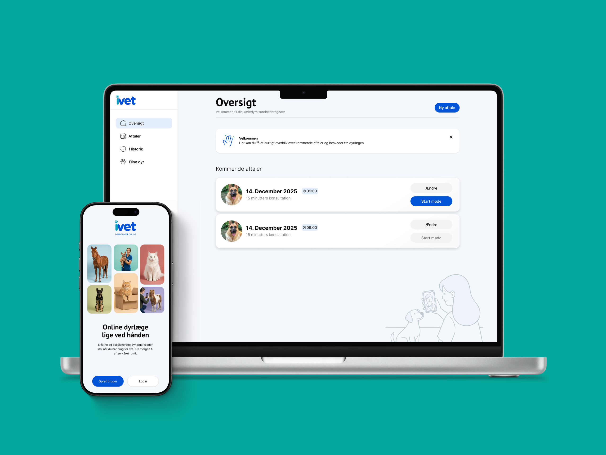
iVet is a Danish telemedicine platform connecting pet owners with qualified vets through online video consultations, available daily from 06:00 to 24:00. Founded by vet Christina Aggerholm in 2022, iVet gained national attention after appearing on DR’s Løvens Hule in January 2024, attracting bids from three investors and landing a deal with Anne Stampe. The platform serves both direct customers and insurance customers through partnerships with several of Denmark’s largest insurers. I was brought in to bring design coherence to a product that had been touched by multiple designers and had grown inconsistent as a result.

Designing for compliance: making complex workflows feel manageable

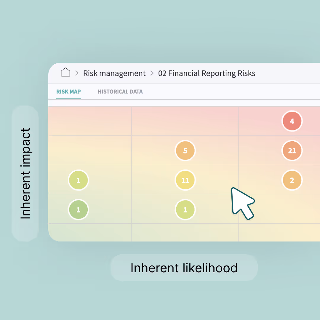
Impero is a cloud-based GRC platform used by 200+ enterprise organizations across Europe, including some of the largest companies in the DAX40. It helps finance, tax, and compliance teams manage risk and internal controls at scale. I joined as Head of Design and spent seven years shaping the product experience from the ground up.