Handyhand.dkOnline services
Case 04 of 07Redesigning Handyhand for clarity, consistency and conversion
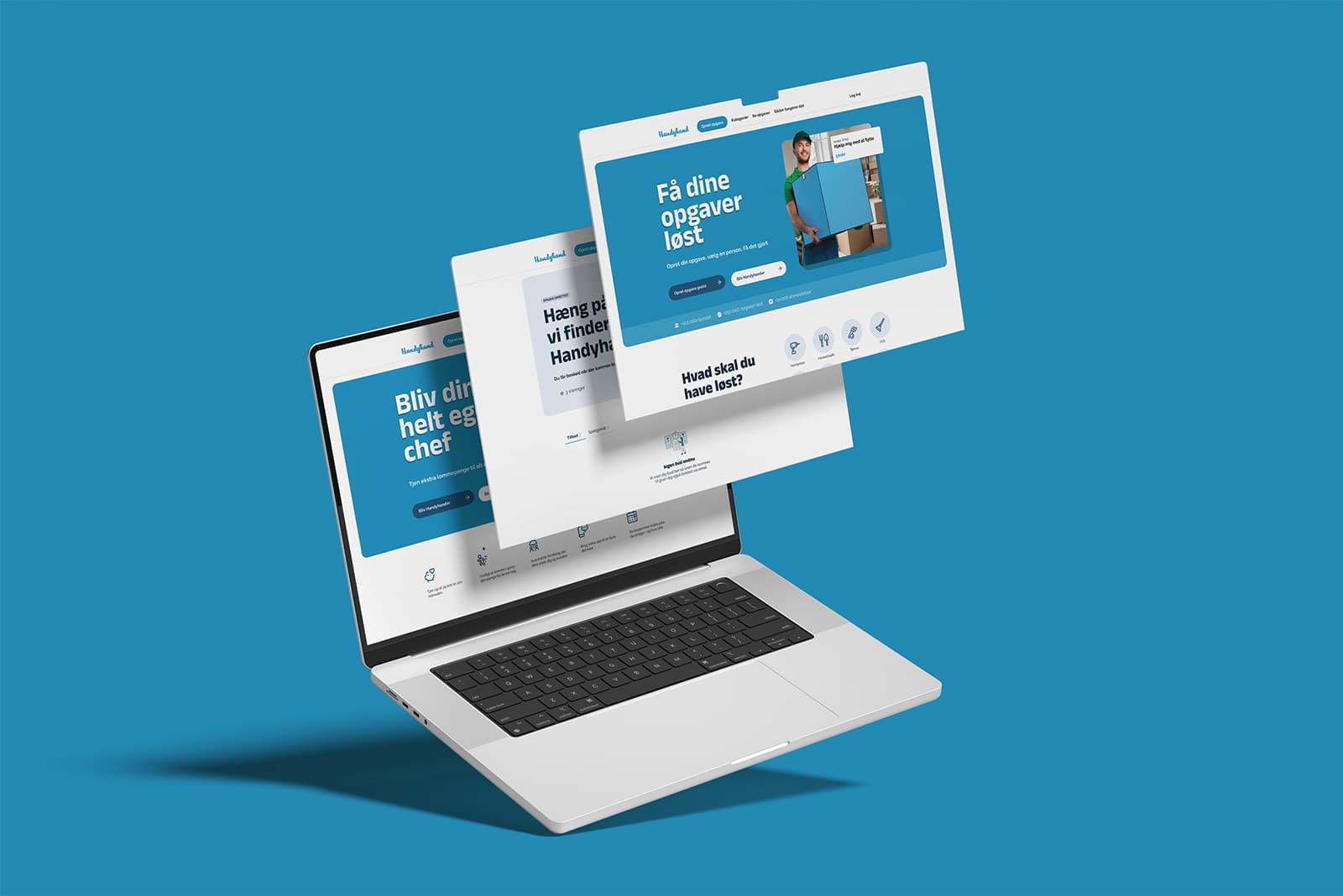
Handyhand connects people who need a job done with people nearby who can do it.
- Role
- Freelance UX & UI designer
- Year
- 2024
- Services
- Market researchCompetitor analysisUser experienceJourney mappingUser interface designIllustration direction
- Year
- 2024
- Platforms
- Web + app
- Research
- Market + competitor
- Outcome
- Conversion up
Challenge
The product worked, but the experience of using it did not match the friendly, local character of the brand.
Inconsistent design patterns across the platform were creating confusion at key decision points, and unclear task flows were getting in the way of users completing what they came to do.
- Inconsistent UI patterns creating friction across the core user journey
- Unclear flows at critical steps, affecting conversion
- A visual identity that didn't reflect the friendly, local character of the platform
- Aligning web and app to a single coherent design language
Research & discovery
The project began with market research and competitor analysis, followed by journey mapping to identify friction points and conversion blockers.
Design approach
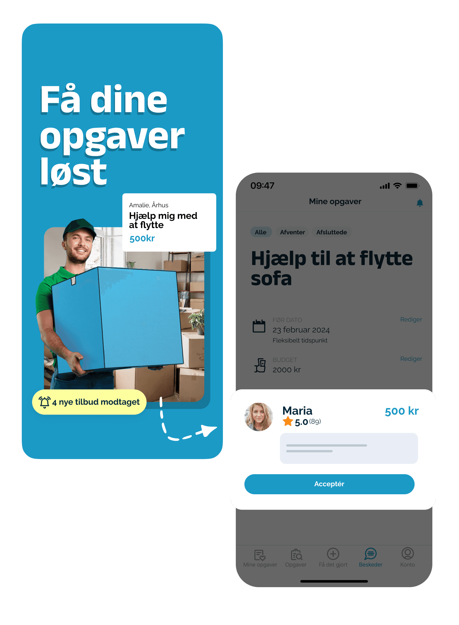
I worked systematically through the core user flows, introducing a consistent component set and cleaner interaction patterns across the platform.
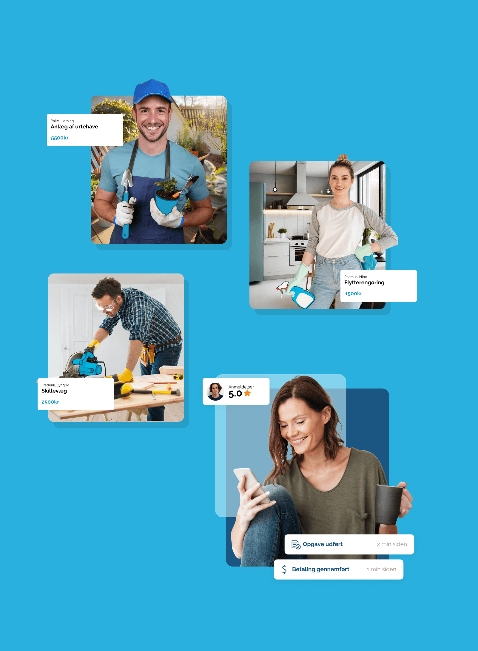
The visual language featured a refined colour palette and custom illustrations, warm and approachable without being naive.
Outcome
- 01
Conversion improved following the launch
- 02
User reviews reflected a noticeably better experience
- 03
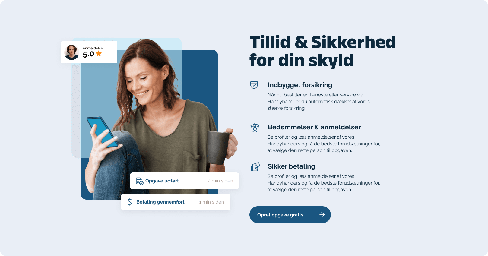
A single coherent design language across web and app
- 04
A consistent component set the team could keep building on
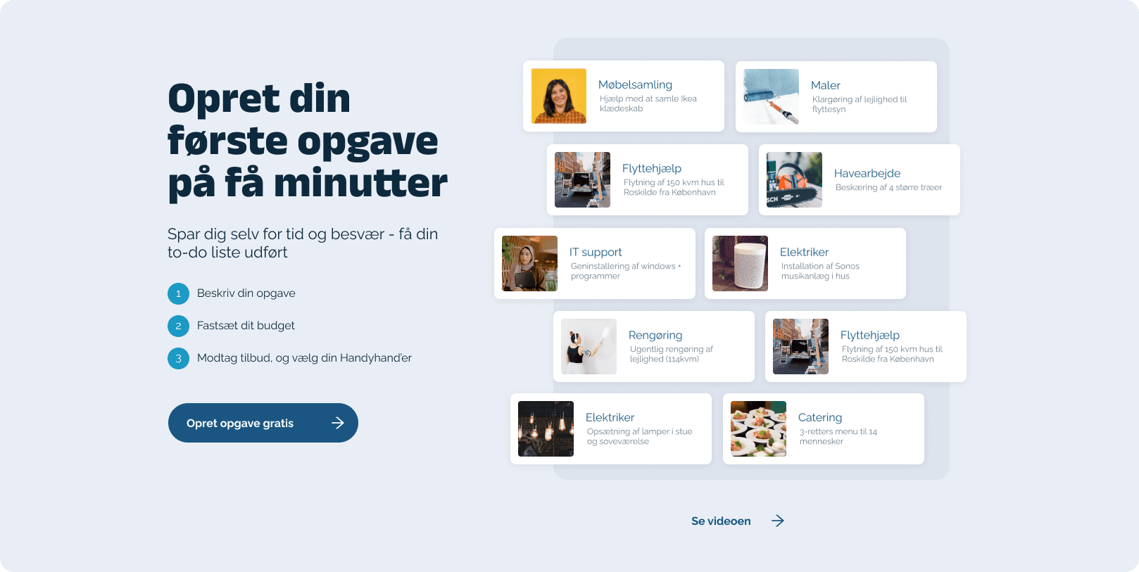
Selected screens
Next case
iVet
Bringing consistency and clarity to iVet's digital experience
